A MONOCHROME VIEW
By Derrick Forster (Area 9)
Having attended last year's Didcot meeting and this year's A.G.M. I feel there might be some support for prints within the Club, as well as slides. At both events there were prints on show - both colour and black-and-white; and a number of members showed an interest.
Personally I enjoy looking at photographs whatever form they are in, and I have done colour slides and colour prints at home in the past. These days, however, I concentrate exclusively on black and white prints.
I have often asked myself what makes some people prefer colour, whilst some prefer black and white photography, so here are a few thoughts and pictures to try and illustrate what I see as the difference between the two, and explain the attraction of the monochrome medium.
It seems to me that some subjects obviously rely on colour for heir appeal, whereas other subjects may be more suitable for black and white. Also, many subjects could be taken on either material depending on the perception of the person taking the picture. People who take colour photographs exploit (explore?) the importance of colours and their inter-relationships as the key factor in the picture. On the other hand, black and white workers have an eye which concentrates on the shapes, lines, tones and textures in the subjects. Some people can do both!
To illustrate the above, have a look at Margary Maskell's beautiful picture of Eilean Donnan Castle (C.R.C. News April-June 2000). To me, the colour version emphasises the subtle hues in the castle walls, the water, the wooded area on the right and the distant hills. The (pure) black and white version makes us notice the shape of the arches and the castle outline, the line of the distant hills, the texture in the foreground and the change in the tone as we go into the far distance. Both versions are successful photographs in their own way. Which do you prefer? It's up to you!
NOTE:
Of course I wouldn't suggest that colour workers ignore shapes, lines, tones and textures; these are all obviously important in nearly all picture-making. Nor would I suggest that monochrome workers ignore colours, indeed we can manipulate the way colours are portrayed on a black and white picture by using filters at the taking stage.
THE PICTURES
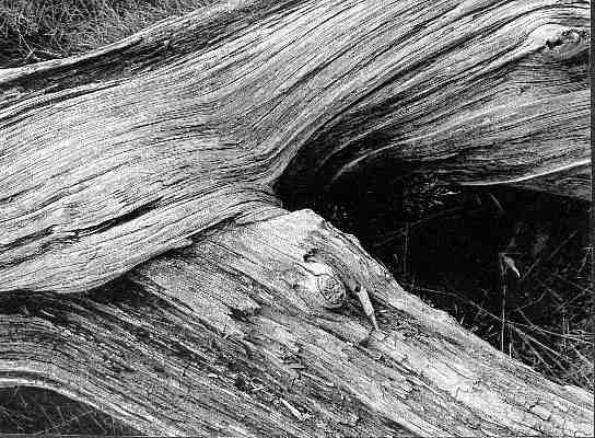
1. Old Wood: The texture of the wood is emphasised. Printing to a light contrast was necessary because of the dullness of the light.
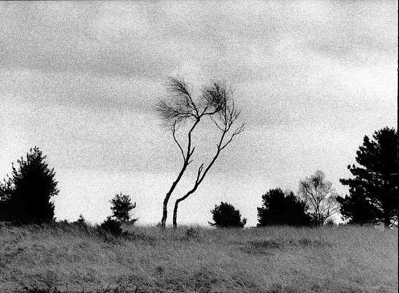
2. Windswept: The shapes of the two trees in the centre stand out against the sky. Their shapes suggest movement.
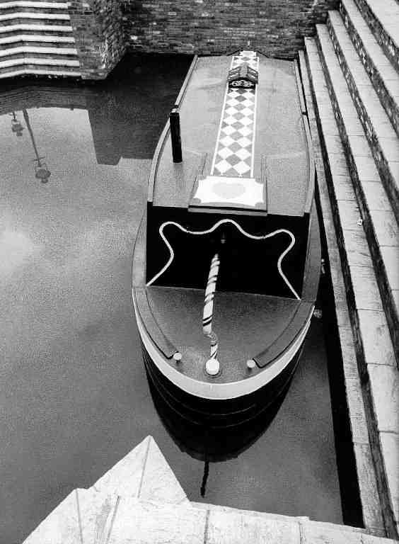
3. Canal Scene: The curved lines of the boat contrast against the straight lines and angular shapes of the surrounding brickwork, steps etc.
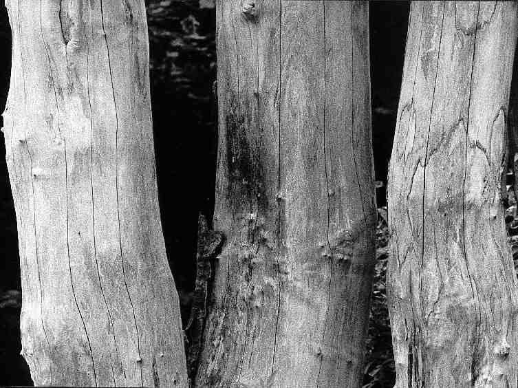
4. Trunks: The shapes of the trunks and the lines formed by the cracks in the wood echo each other. The knobbly texture of the trunks also shows.
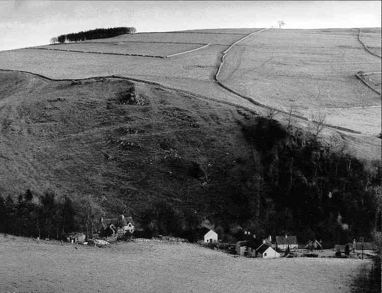
5. Milldale: The tones of the land behind the farm show up the shape of the hillside